Is the Maryland flag a design outlier?
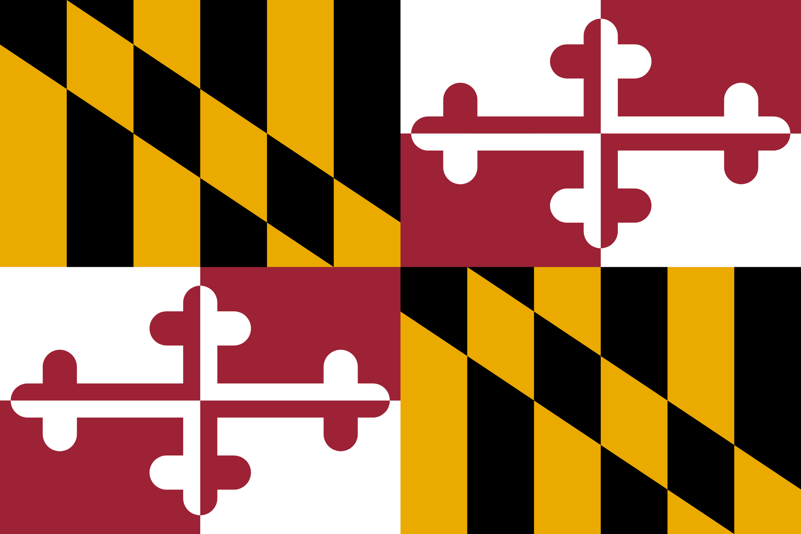
I’ve lived in Maryland for ~2 years now and have always been amazed at two things immediately since moving here: 1) crabs and Old Bay really set the tone of “Maryland” in a very philosophical way and 2) there is a lot of pride in the Maryland flag in daily life. Like a lot of pride for the Maryland flag - much more than any other state that I’ve ever lived in. I’ve seen many more of these flags on houses, bumper stickers, and merchandise than I ever thought I would see for a state flag.
On the face of it – the flag seems quite unique in design. With a majority color combination that is not common across a number of US flags (red, black, gold) and a distinct lack of a shade of blue that is on most flags. The checkerboard pattern is also quite unique across flags.

This fascination with the fascination of Marylanders with their state flag, along with some recently re-designed state flags, made me wonder about whether the Maryland flag really is as much of an aesthetic outlier as I thought? To systematically look at this, I got a set of images of the US state flags (as of 2023) and started some exporatory data analysis.
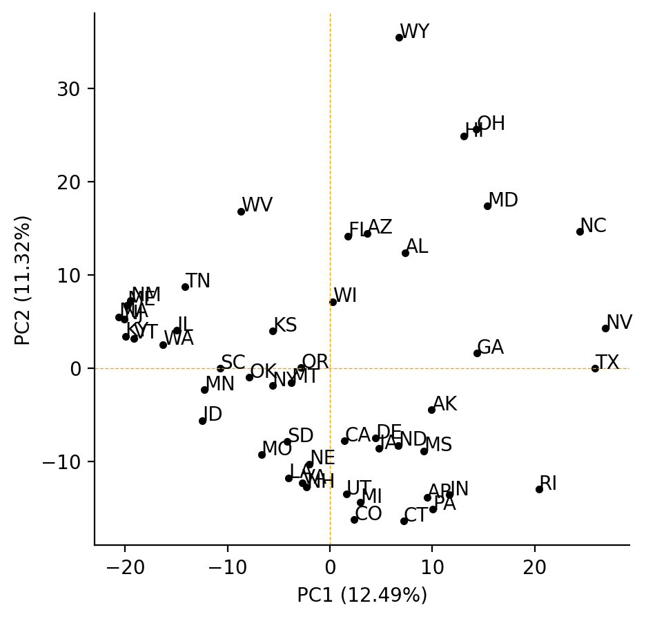
Rather than just using the RGB pixel values as features, I used a common image feature extractor to try to better capture certain patterns (like the checkerboard like pattern, or symmetry along the diagnonal). I first started with PCA of these features across all US flags:


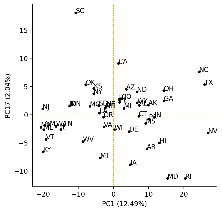
But when we look at just PC17, the Maryland flag is certainly on the extreme but that PC only explains two percent of the variance! It is possible that more reliable image feature extraction that specifically focuses on shapes may have a stronger ability to separate these flags.


So its not immediately clear from a data perspective that Maryland has a flag that is stylistically an extreme! It’ll always be a wild (yet unforgettable) flag in my mind though. If you’re interested in recreating these analyses you can download the US Flags PNGs and follow this notebook with my code.